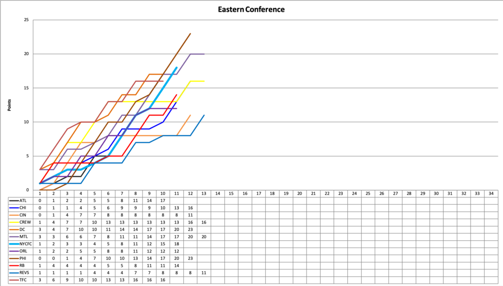
It’s hard to see but that brown line above all others represents both Philadelphia and DC, who have matched each other result-for result at the top for 3 games now. At this point in the season I find the bottom chart more useful for understanding both where everyone is combined with how many games they have played. At the end of next week, NYCFC will have the fewest games played of any team in the East. Right now, only the 2 leaders mentioned above have done better than NYC through 11 games, though Atlanta has a better PPG through 10 games.

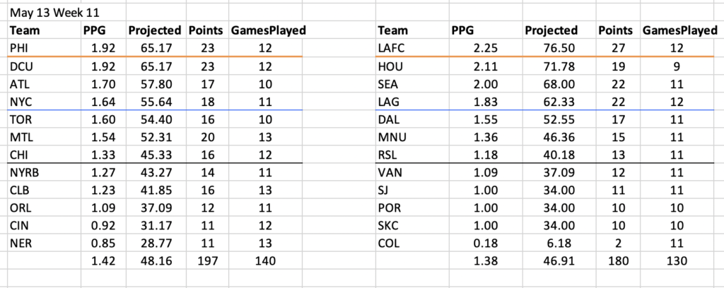
And also note, that just like that, the East has a better combined PPG than the West, and it’s not all Colorado dragging them down. The East now has a slight advantage in the head to head match-up, but where they win the overall PPG is in the middle of the table. The top of the West is doing much better than anybody in the East.
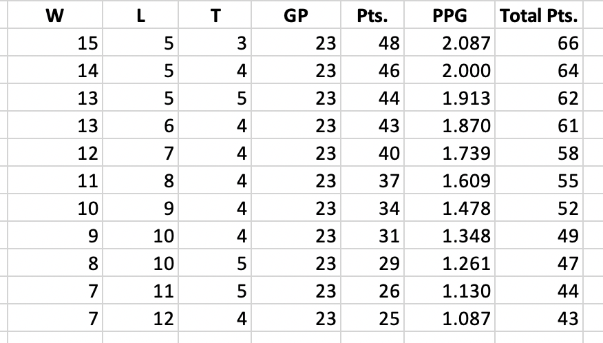
For NYCFC, I don’t think many anticipated getting above the blue line so soon after 5 points and no wins in the first 6 games. The how-do-we-get-to table also looks more reasonable, with that elusive 60-something neighborhood looking possible (not probable but possible) for the first time in a while.

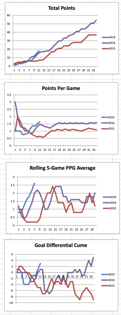
Finally, another 6 or so games of good underlying data, good form and good results, and I’ll consider replacing 2015 in the year-to-year line graphs:
2016 remains an apt comparison, and the lines act as a reminder that after the initial bad start with way too many home draws, NYCFC recovered with 3 straight wins, only to slide back down with 2 points in 4 games that included the RB Wedding and a dispiriting home loss to a weak RSL side. Whether the 2019 edition does anything similar is not necessarily dispositive of anything, but my sense is they end up somewhere in the same mid-50 point neighborhood, however they get there.
Leave a Reply